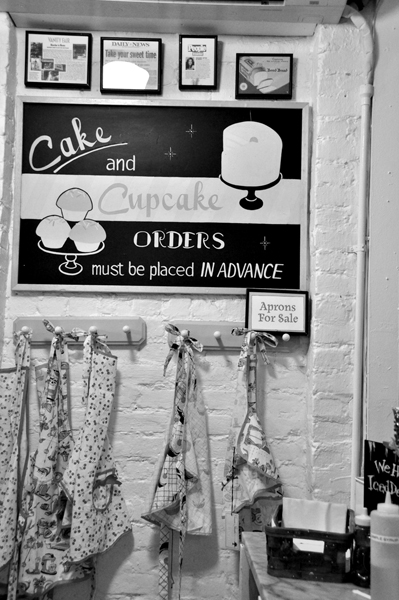
In addition to being a photographer, I also work as a graphic designer. These two fields and interests have been combined into my love of photographing typography, or letterforms. This may seem like a very small niche of interest with limited possibilities, but the complete opposite is true. Walking down the street on a normal day, you can see hundreds of examples of typography that is unique and can make amazing shots. Some are weathered and beaten, some contemporary and some fall in the realm of advertising. I have included some examples of typography that I have shot over the past couple of years. The first set shows how printed typography that you see in your daily life can create great colors and compositions.
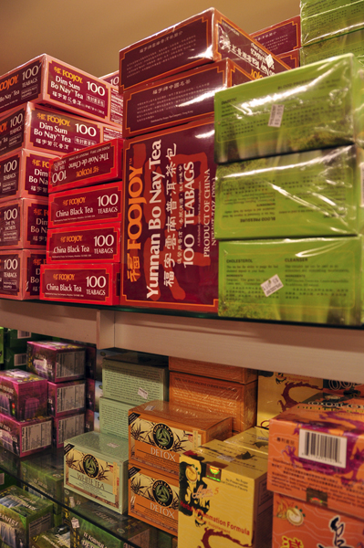
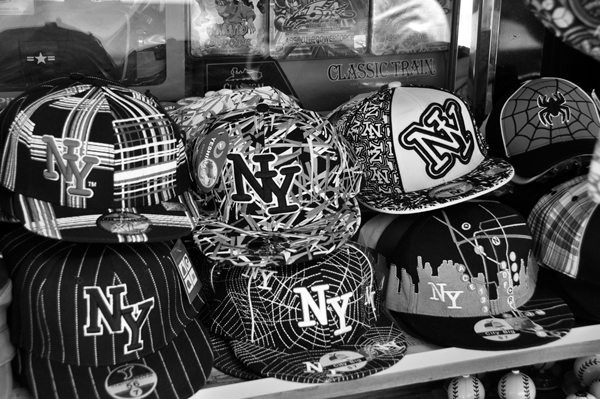
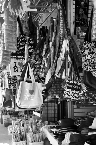
You can find these kind of samples in the grocery store, on the street or in restaurants. You will be amazed the variety of shapes and contrast you can pick up by being observant in your every-day life.
Some other examples I have are of typography in environmental space. This can be painted on walls or windows, on banners, printed on the street or in completely unexpected places. They can be small or large and are a great way to catch the feeling and emotion of the location. Do not worry about being able to read everything or to get the whole piece in one shot. Sometimes the details are what are really interesting!
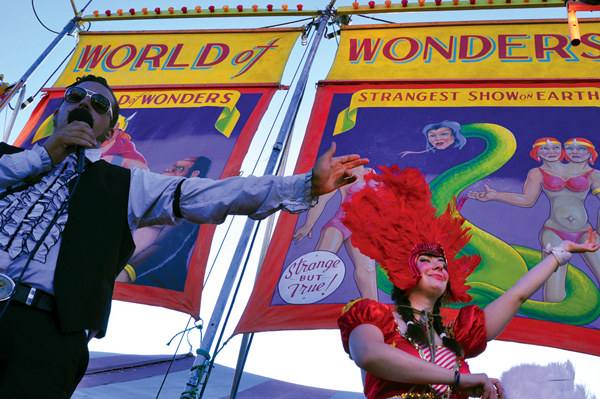
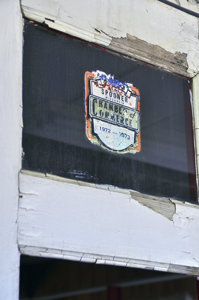
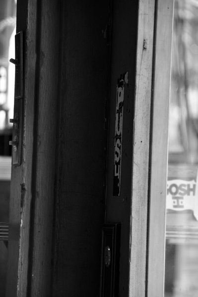
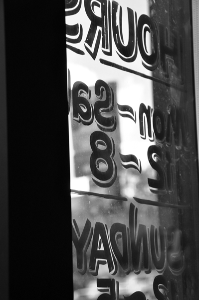
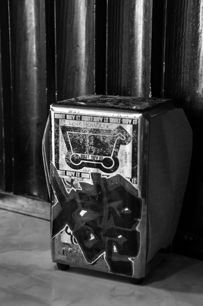
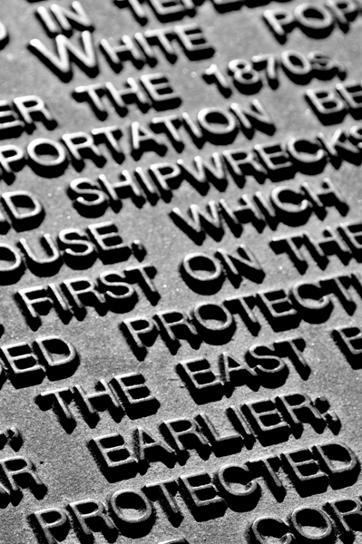
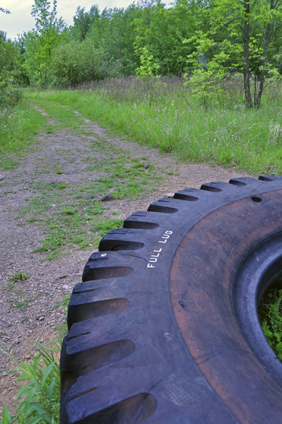
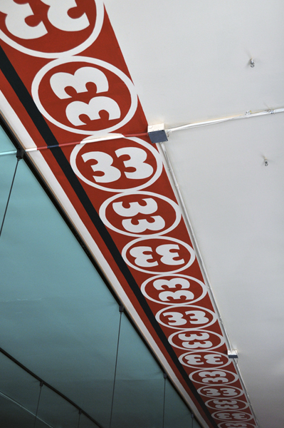
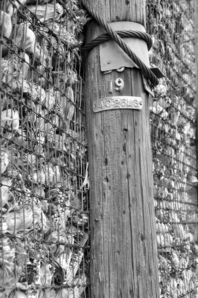
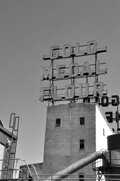
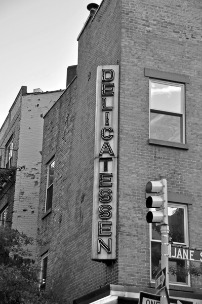
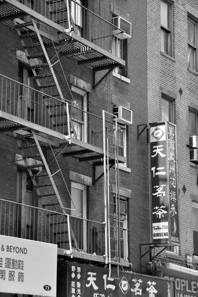
The most well known types of typographic photography are of signage. They are all over the place in almost every location. Many times they are illuminated which can make for some fantastic color and night shots. Carry your camera with you on walks and you can catch some of the great Americana and unique locations or your town or city. My hometown of Minneapolis is famous for its mills (Pillsbury and Gold Medal Flour) so those are some of the best places to photograph signage. One great tip is to check out liquor stores; they often have the best signs and typography!
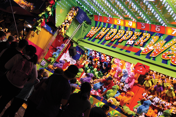
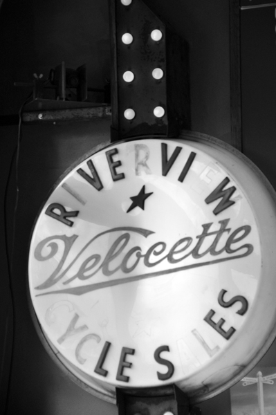
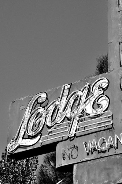
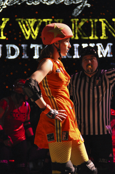


Often, the most ordinary things in your everyday life can be the most interesting for photography. It is also a great way to keep a record or your travels and experiences. Typography does not need to be something just for designers. It is different everywhere you go and you will see as a photographer that the different lines and shapes are great details for color or black and white photography.