In my previous post, I discussed the benefits of using negative space in photography. In this post, I will discuss the opposite; when filling the shot with content can add drama and overall meaning to a photograph.
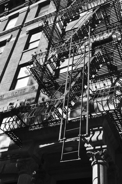
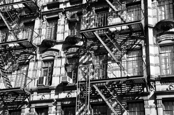
In many cases, there almost seems to be more content than you can fit into one photograph. Sometimes, this fact can be used to the photographer’s advantage. It can be used to convey the fullness of the space or the feeling of the environment you are shooting. In the two cases above, I chose to fill the space from edge to edge in order to show the compactness of objects, which made sense for the denseness of New York City. Many people know the environment of New York because of the huge population for its overall land space. By showing still objects that still convey this sense of enormity adds an even greater drama to the photograph.
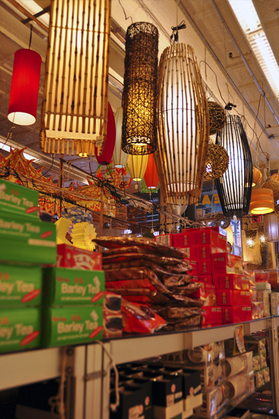
Using the entire space can also enhance the variety of colors that may be in a shot. The amount of content can enhance the hues and tones that are available in the space. When accompanied by a strong black, this can become even more dramatic.
The other main use for filling the space from edge to edge is to concentrate on a large amount of detail. When shooting a macro shot, often one or two pieces are in focus because of the depth of field. When the amount of detail available to focus on is too great to capture, this device of filling the shot is very effective. It also adds high contrast and sharp details to many aspects of the shot.
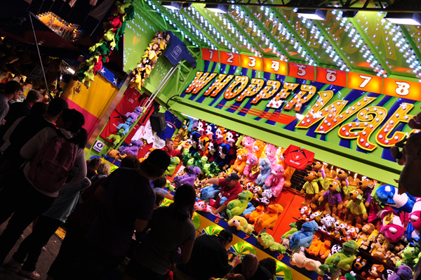
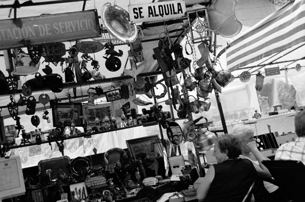
While using negative and open space is very effective, in some photographs, it is very fun and eclectic to add a jumble of objects and express the space as diverse and overlapping. This shot of a street fair in Buenos Aires would not have shown the antiquity and chaos if the whole space had not been used.
Filling the space with content also does not mean that the photographer should not compose the shot. Composition and angles should still be considered carefully so that the photograph is unique and the emotion of the location is captured. Filling the space from edge to edge also means considering what lies on the edges and what contrast can be shown to lead the eye around the composition. The shot can be a narrative even with a large amount of content. It should not be considered a flat color or layout but rather a story to be told each detail that is included.




Pingback: AnimHuT User Link Feed 2010-July19-25 » Design, Free, Your, Today, Designs, This » AnimHuT