When it comes to taking a great photo, it all comes down to the lighting and composition, rather than how expensive the camera equipment is. Today, we’re going to highlight a composition technique called Rule of Thirds. It’s a very simple rule to grasp and can instantly turn some of those boring photos into something much more interesting and visually pleasant.
Visual aesthetics is something subjective. You might think a particular photo is nothing special, while your friend loves it to death. The Rule of Thirds is a simple guideline to help you produce a photo that is more likely to be visually stunning based on how you compose and frame your subject.
Nevertheless, I want to stress that Rule of Thirds is just a guideline, rather than a must-follow rule in taking good photographs. Sometimes, breaking photography rules can also produce some stunning photos.
1.) What is Rule of Thirds?
You might have already stumbled across Rule of Thirds. Ever seen those “annoying” lines running horizontally and vertically on your camera’s LCD screen?
Well, you might think that the grid is there to help you compose everything in the center, but it’s actually quite the opposite.
The basic idea behind Rule of Thirds is to think of a photo divided evenly into thirds.
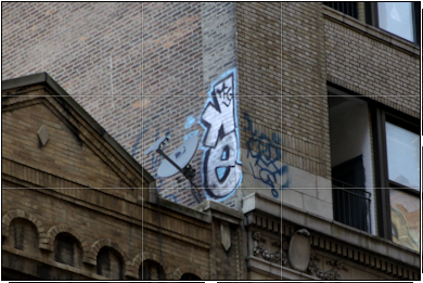
You might naturally place your subject dead center in the middle of the screen:
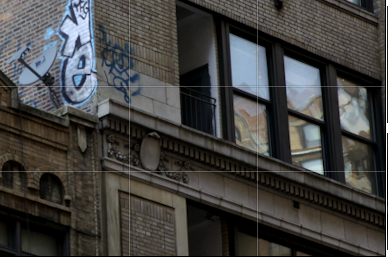
Or center of the other panels:
Good try, but nope.
2.) Where to Place Your Subject
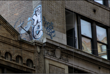
The Rule of Thirds tells us to place main elements where the lines intersect, so where the red dots are. Those red dots are referred to as power points.
The concept is that by placing main elements and subjects at the power points would create a more balanced photograph and engage the viewer more readily. The photograph would be more aesthetically pleasing and easy on the eye.
3.) How to Compose a Rule of Thirds Photo
The easiest way is to switch to grid view on your camera and get use to Rule of Thirds. You might find yourself zooming in, shifting the lens or moving around to get the right composition. Before you know, you’re able to turn the grid-mode off and naturally be able to place subjects in the power points.
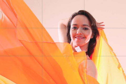
However, a lot of the times, you can “cheat” in digital post-processing by cropping the photo accordingly so that the subject is in the correct spot.
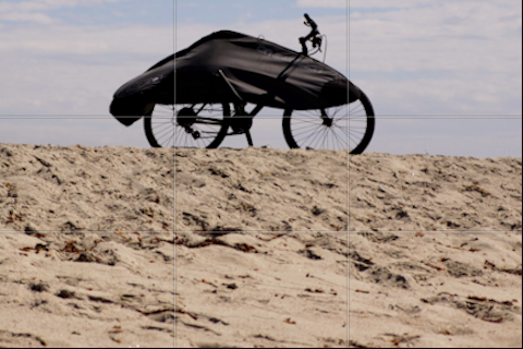
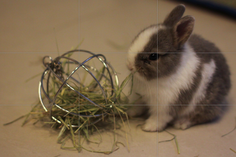
Here are some examples:
Have any great examples to show us that demonstrates Rule of Thirds? Or maybe you would like us to showcase another composition rule in photography? Comment below and let us know!





Pingback: Citizen Journalism 101: News photography made easy « Ben Franklin Journalism