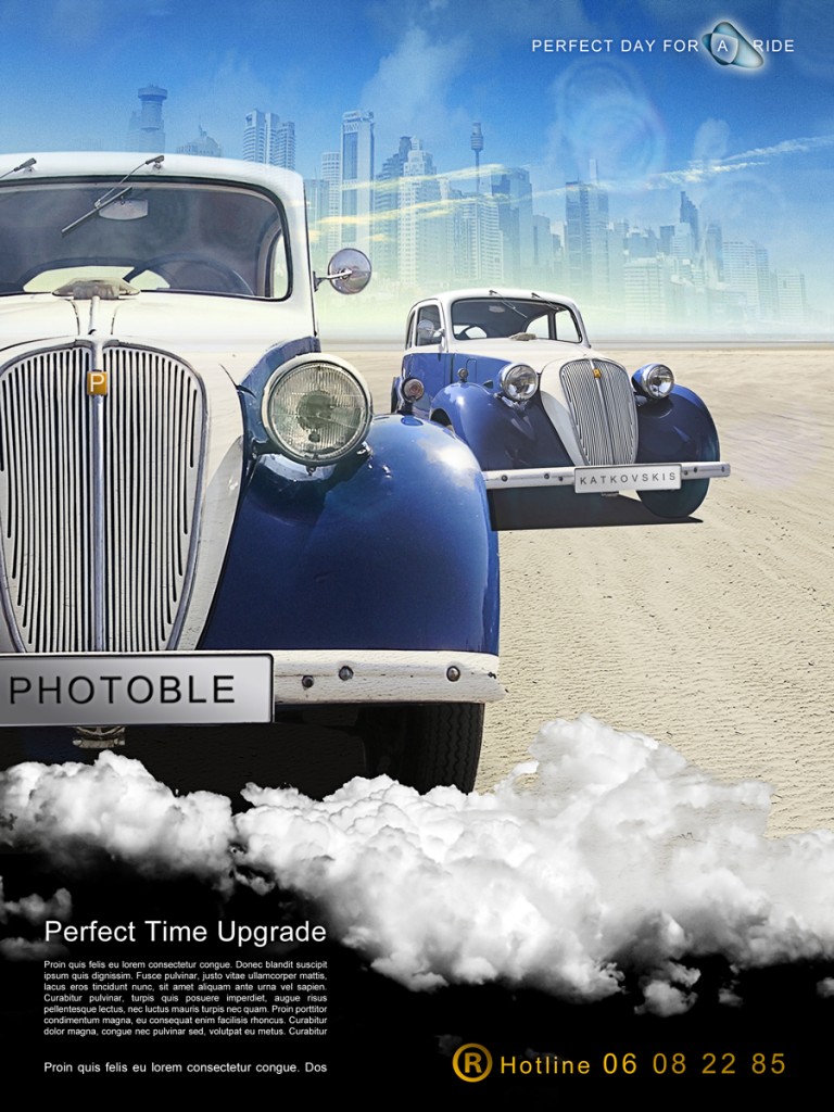
This time I will make something you usually see in the magazines – a car advertisment. During the tutorial I will use mostly the same techniques as in the Glowing Bottle tutorial, for this reason I will not be very detailed about the steps for specific action.
I will use only free stock photos to make this composition. Pictures are taken from SXC.hu.
Final Image
Step 1 : Positioning
Now let’s start adding pictures
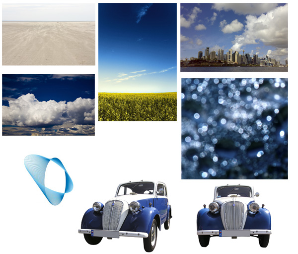
-) Create new white blank Photoshop document ( I did 2250 x 3000 px)
-) Take background from here.
-) Position background as shown in the picture
-) Create New Layer with the sky image and use gradient to mask it
-) Next is the city, mask it, put Soft Light blending mode and use Free Tranform tool to make city taller.
Step 2 : Adding elements
Now the complicated part. Adding the cars.
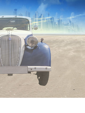
-) Mask the car. I used two different techniques:
For big and more or less plain areas I used Magic Wand tool and for more accurate cuts I used Pen tool, especially for making selection on the top of the car where it blends with it’s white background. Put 60 % opacity for this layer. This will be smething like see through reflection.
-) Copy layer and put 100% opacity to it.
And now with Magic Wand tool select white zones inside the car and mask them. The layer itself will look like in white areas you have nothing and you see through.
-)Make New Layer and with Polygonal tool draw the shadow under the car. Don’t forget shadows ! They make the picture look alive.
-) And put for shadows 90% opacity
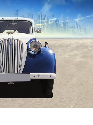
As you can see now the picture look more realistic.
-) For the second car I didn’t use the see through reflection step because this car is not main one.
-) Scale and position it.
-) Mask it. And don’t forget the windows. You may mask them with grey color so they are not completely transparent.
-) Now when you see the picture use Free Ttransform > perspective or distort and adjust the car so it fits the perspective.
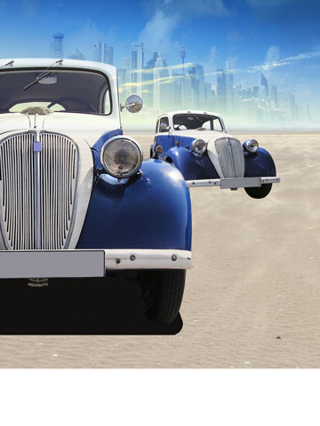
-) Add shadow under the second car also with the 90% opacity.
-)Add something similar to flares, it’s only for to make whole image more alive and dynamic.
-) Set the Lighten blending mode.
-) Add New Layer and fill it with white to transparent gradient. The white should start on the first car go in to the direction of another
-)Mask out the first car. And with this effect we make second car to be a little bit further and not to have the same contrast.
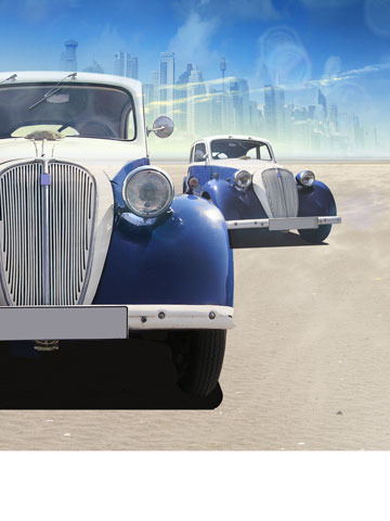
Now let’s add the bottom.
-) Take the clouds picture.
-) Scale it so it fits the width of the picture
And now we have to get white clouds:
-) Select this layer , Ctrl+click the layer
-) Ctrl+C (copy)
-) Select the Channels tab and Create new channel
-) Hit Ctrl+V (paste)
-) Hit Ctrl+L (levels)
-) Adjust levels , make black darker and whites lighter
-) Click ok, and cltr+click this Channel to make selection.
-) Hit Ctrl + C, hide Alpha channel and make visible RGB.
-) Return to Layers Tab and Create new layer and hit alt+backspace (fill) , make sure you have white color in color squares.
Now you have pasted mainly highlights and midtones.
-) Mask the layer and play with opacity.
-) Duplicate the layer if necessary in Screen blending mode
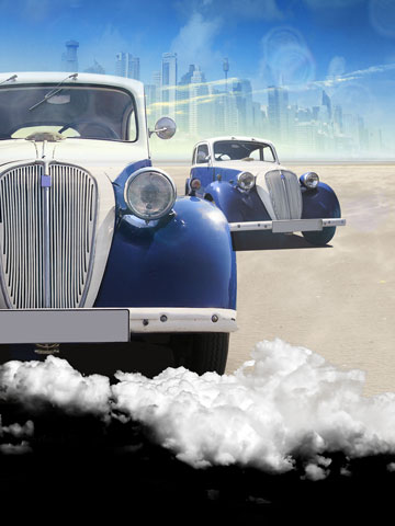
Step 3 : Text
Usually in the magazines you see a lot of text besides the (car) image. And it’s full of logos, telephones , brand advirtising and addresses. The more expensive the car, the less information is being given and the other way around. However not always.
Text font is Arial
-) Add some logo
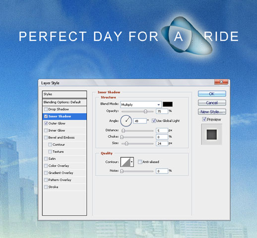 I used these settings for Inner shadow and more or less standart settings for Outer Glow
Working with text sometimes you need to fill the space because you don’t have any specific text yet, and here’s what I used http://www.lipsum.com/feed/htm
Step 4 : Finalizing
-) Dodging the car lights (brightening the highlights )
-) Flatten and sharpen the image
And that’s it !
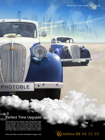
Conclusion
Here you can see one of the composition templates that I use when I do double portraits. One is facing into the camera and other one is a profile or looking into the other direction.The same you can observe in the movie posters. I will cover compositions in some of my later articles, but for now – enjoy this one !
